
1.10 Image & Size Specs for Content Layouts
In this article group
- 1.1 Login Process for Veya CMS
- 1.2 How to Recover Access to the CMS
- 1.3 Exploring the Dashboard and CMS
- 1.4 Select Your Brand with the Tenant Filter
- 1.5 Overview of Pages and Layouts
- 1.6 Save a Draft, Preview and Publish
- 1.7 Preview Page Changes Across Devices
- 1.8 Restore a Previous Page Version
- 1.9 Upload and Organize Images in the Media Library
This guide outlines the essential image size specifications for Content Layouts within the CMS. By adhering to these guidelines, you can ensure that your visuals are optimized for both desktop and mobile experiences.
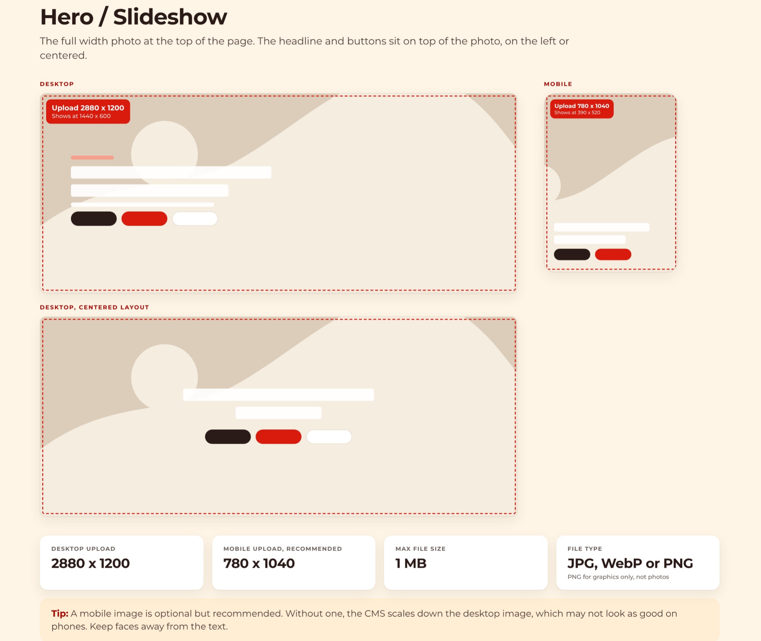
1. Hero / Slideshow Image Guidelines
The Hero or Slideshow is a full-width photo at the top of the page. For desktop, upload 2880 x 1200 pixels, and for mobile, 780 x 1040 pixels is recommended. Use JPG, WebP, or PNG formats.
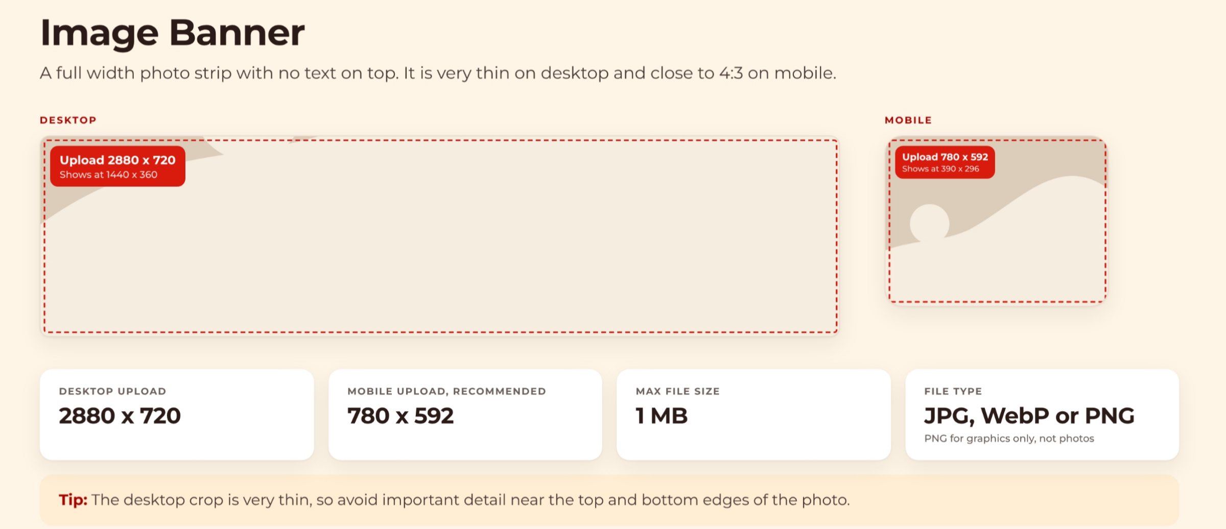
2. Image Banner Specifications
The Image Banner is a full-width photo strip without text. Desktop uploads should be 2880 x 720 pixels, while mobile recommends 780 x 592 pixels. Remember to avoid important details near the thin desktop crop edges.
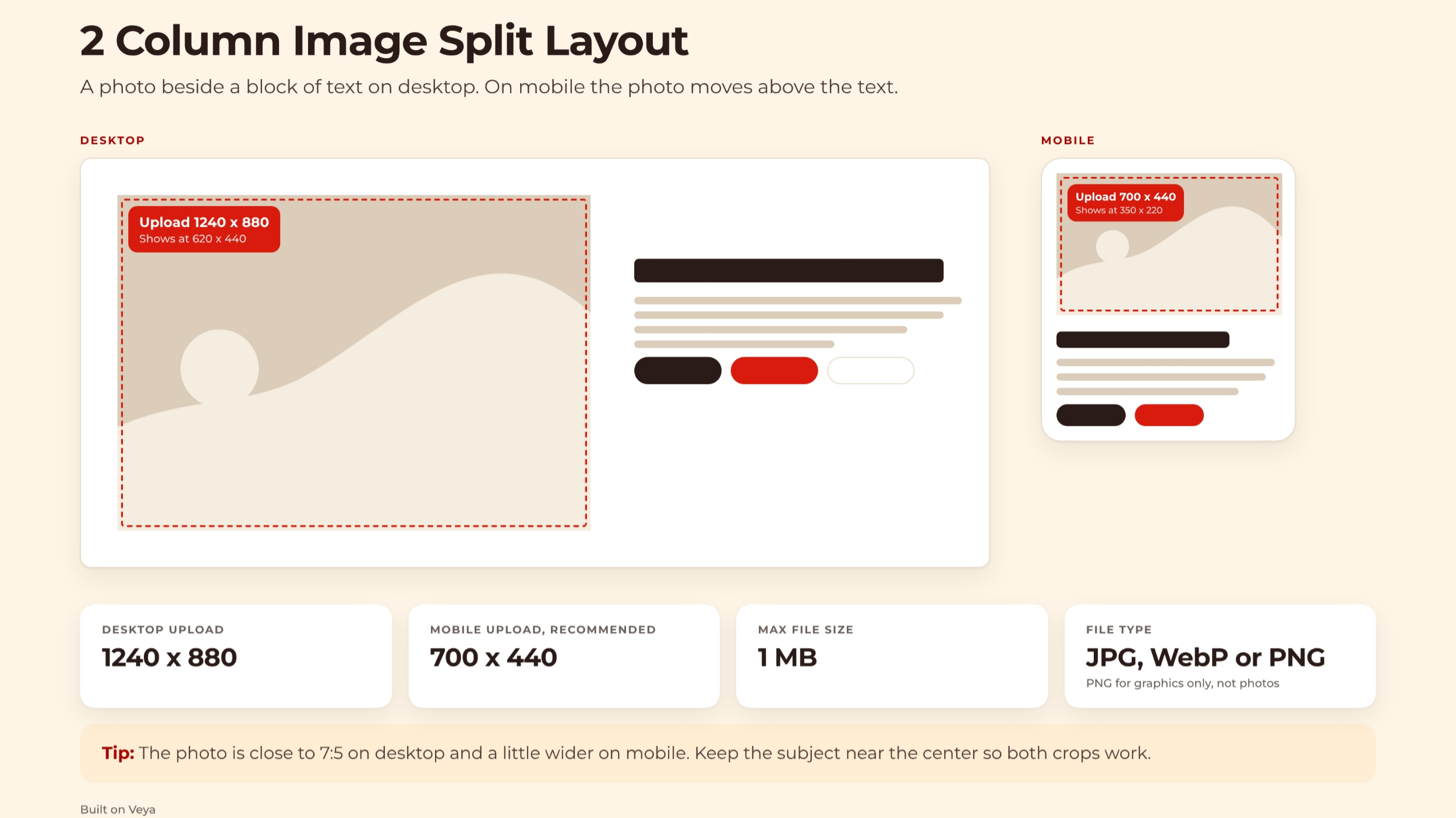
3. Two Column Image Split Layout
The two column image split layout features a photo beside text on desktop, with the photo moving above text on mobile. Upload desktop images at 1240 x 880 pixels and mobile at 700 x 440 pixels. Keep subjects centered for optimal cropping.
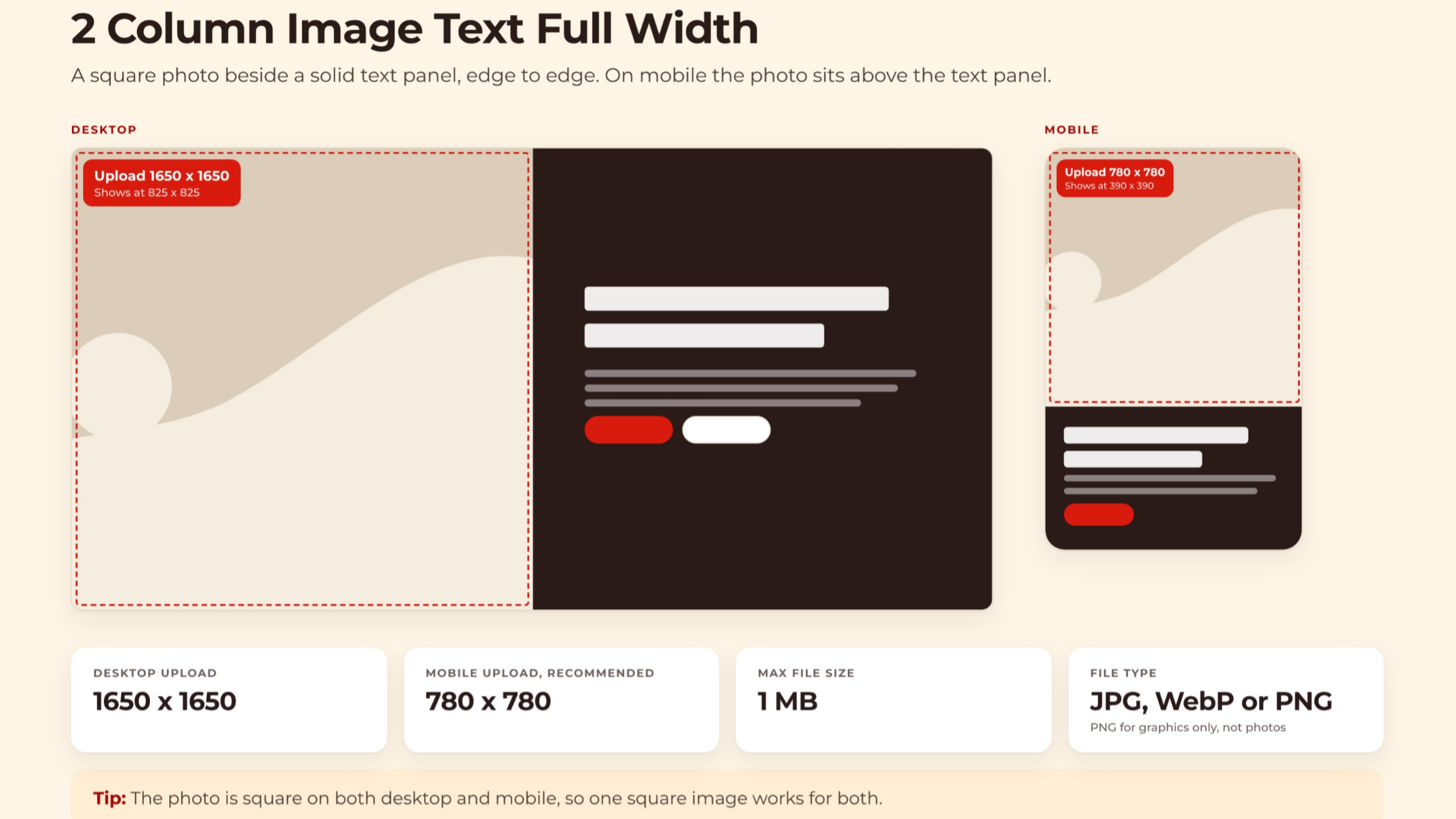
4. Two Column Image Text Full Width
In the two-column layout featuring a full-width image and text, a square photo is positioned next to a text panel. Please upload images at 1650 x 1650 pixels for desktop and 780 x 780 pixels for mobile. A single square image will suffice for both views.
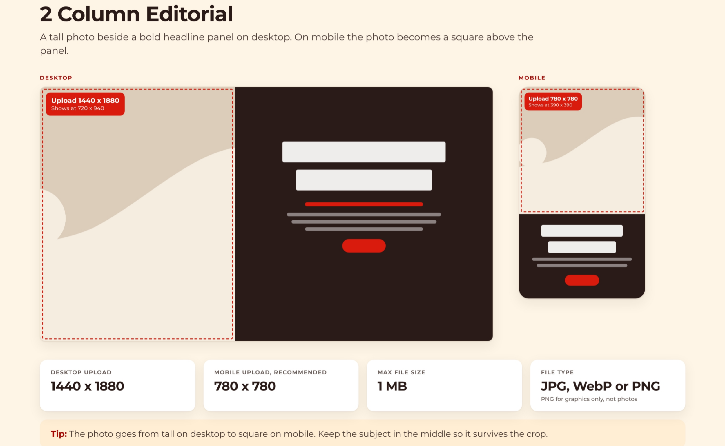
5. Two Column Editorial Layout
The 2 Column Editorial layout features a tall photo alongside a headline panel. For desktop uploads, use dimensions of 1440 x 1880 pixels, which transition to a square format of 780 x 780 pixels on mobile. Ensure your subject is centered to allow for cropping.
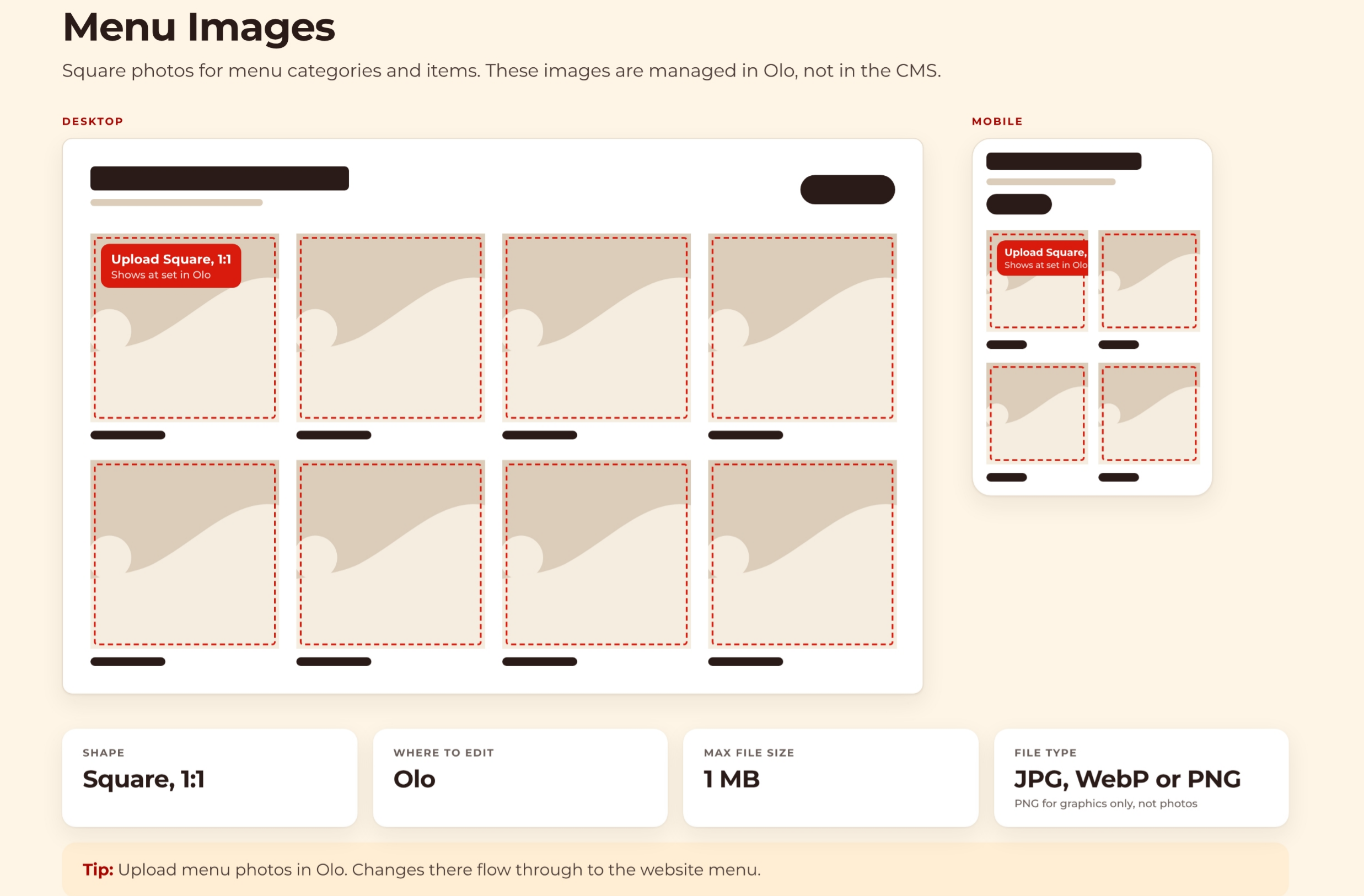
6. Menu Image Guidelines
Menu images are square photos for categories and items, managed in Olo rather than the CMS. Please upload square images with a 1:1 ratio. Any changes made in Olo will be reflected directly on the website menu and in the layouts of featured items or categories.
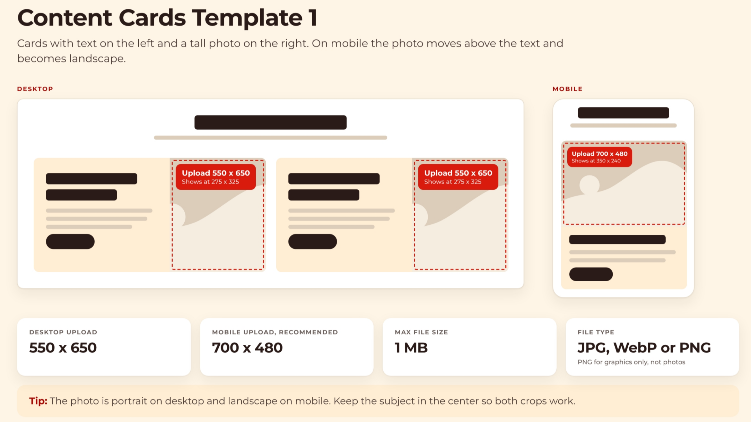
7. Content Cards Template 1a
This content card template presents text on the left and a tall image on the right. For desktop, the images should be 550 x 650 pixels, while on mobile, they transition to a landscape format of 700 x 480 pixels. Ensure the subject is centered for optimal cropping.
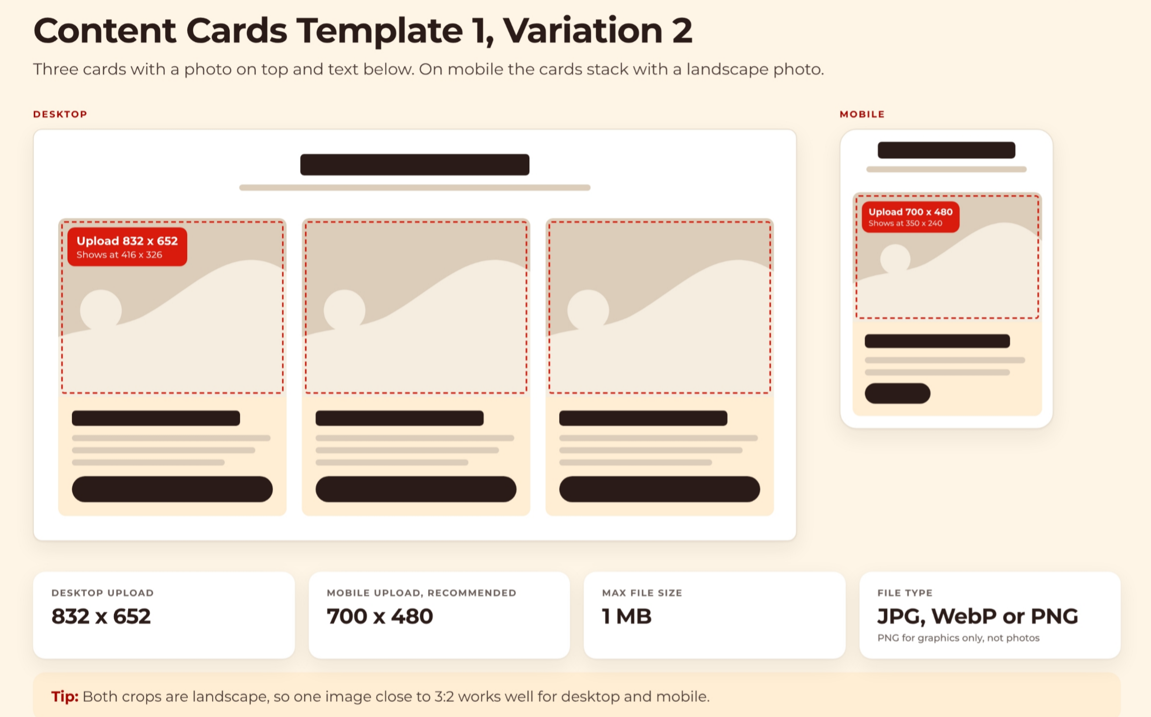
8. Content Cards Template 1b
This content card variation uses three cards with a photo on top and text below. Desktop uploads are 832 x 652 pixels, and mobile uses 700 x 480 pixels. Both crops are landscape, so one 3:2 image works well.
9. Content Cards Template 2
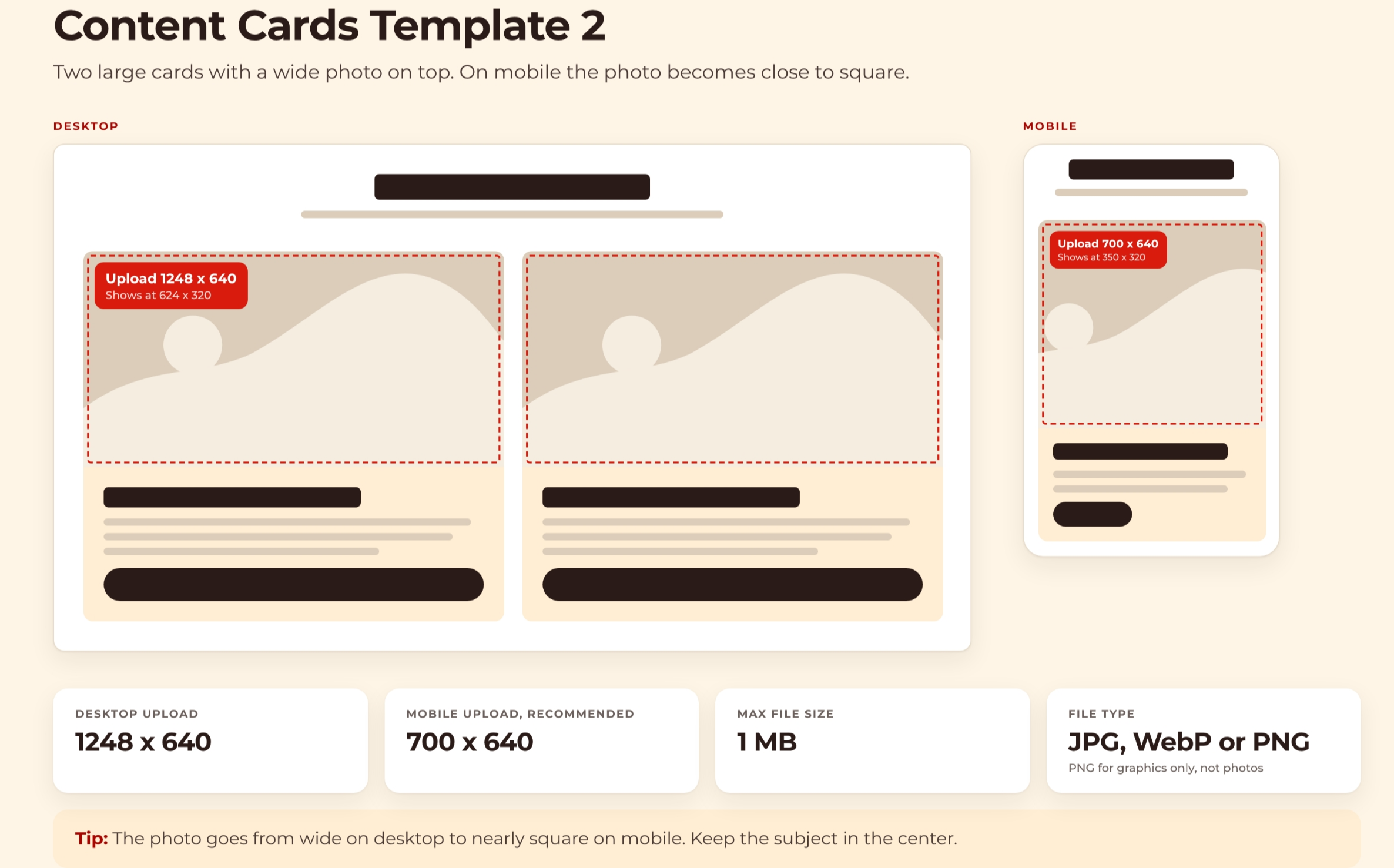
Content Cards Template 2 features two large cards with a wide photo on top. Desktop uploads are 1248 x 640 pixels, becoming nearly square 700 x 640 pixels on mobile. Ensure the subject remains centered.
10. Download App Banner Specifications
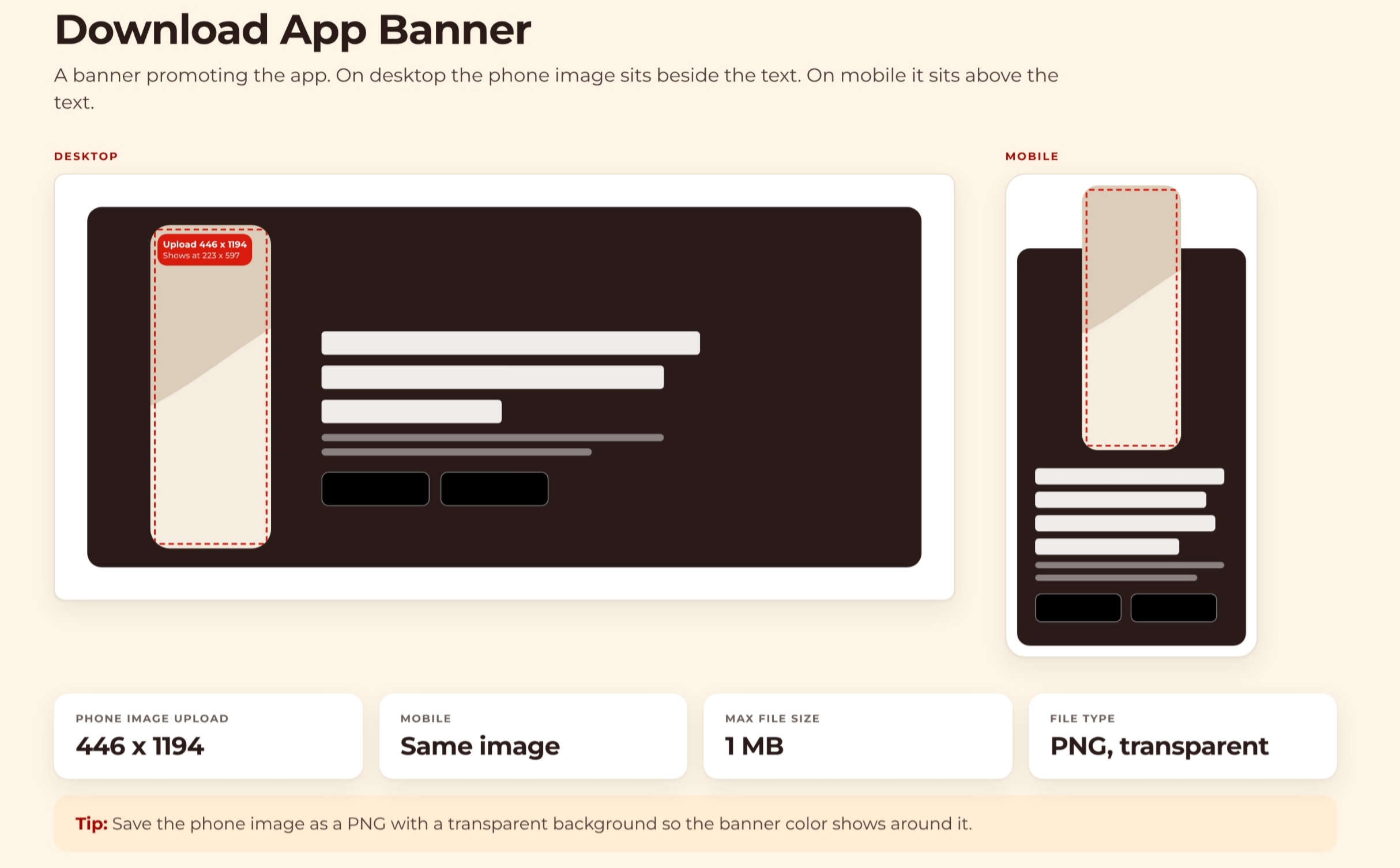
The Download App Banner promotes the app, with the phone image beside text on desktop and above text on mobile. Upload phone images at 446 x 1194 pixels. Use a transparent PNG for the phone image.
In summary, optimizing image sizes and types for each content layout is crucial for visual quality across devices. Always consider desktop and mobile dimensions, file types, and subject placement to ensure your content looks its best.