
1.7 Preview Page Changes Across Devices
In this article group
- 1.1 Login Process for Veya CMS
- 1.2 How to Recover Access to the CMS
- 1.3 Exploring the Dashboard and CMS
- 1.4 Select Your Brand with the Tenant Filter
- 1.5 Overview of Pages and Layouts
- 1.6 Save a Draft, Preview and Publish
- 1.8 Restore a Previous Page Version
- 1.9 Upload and Organize Images in the Media Library
- 1.10 Image & Size Specs for Content Layouts
This walkthrough provides guidance on how to preview your page changes across various device sizes to ensure a responsive design. You will learn how to toggle between desktop, tablet, and mobile views, as well as how to open the preview in a separate window for a more detailed inspection.
Go to cms.builtonveya.com
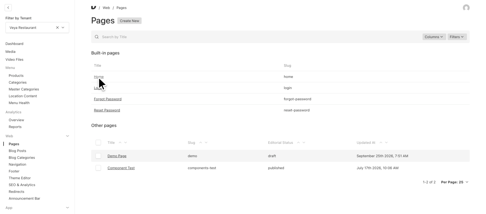
1. Navigate to Homepage Preview
Start by visiting one of your pages. In this example we will head to our homepage to preview our page across various device views.
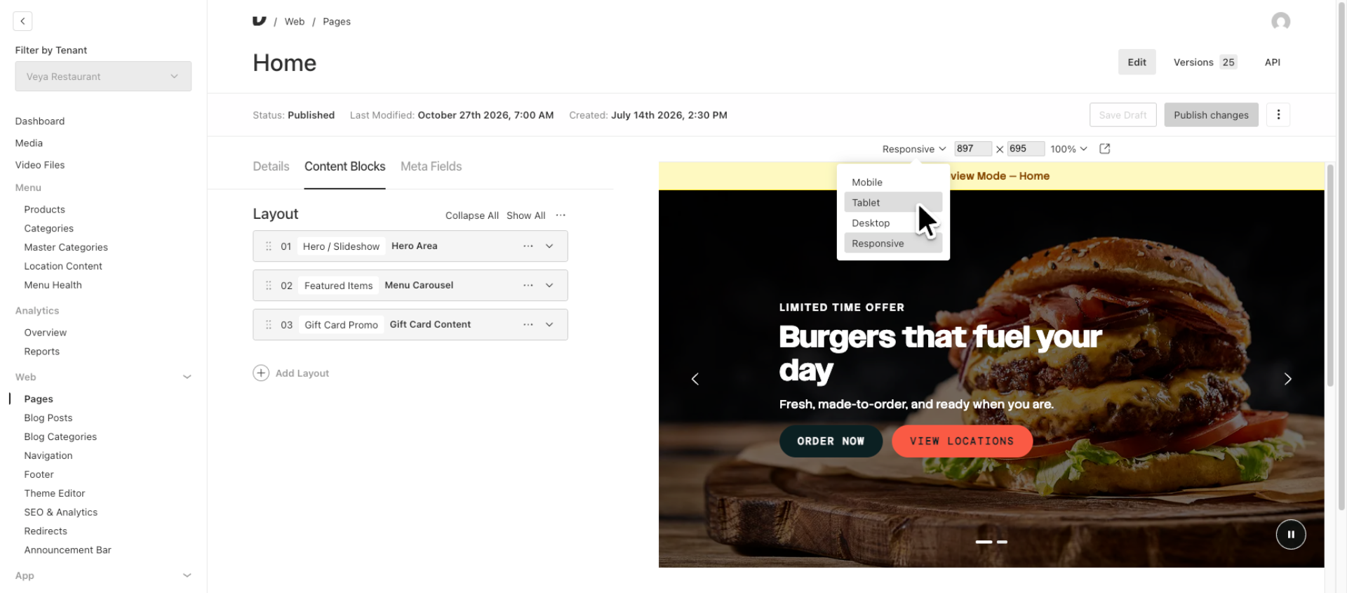
2. Select Tablet View
In the preview area, observe the current responsive view. To change views click the down arrow next to the device size and select size you wish to review. Lets select Tablet.
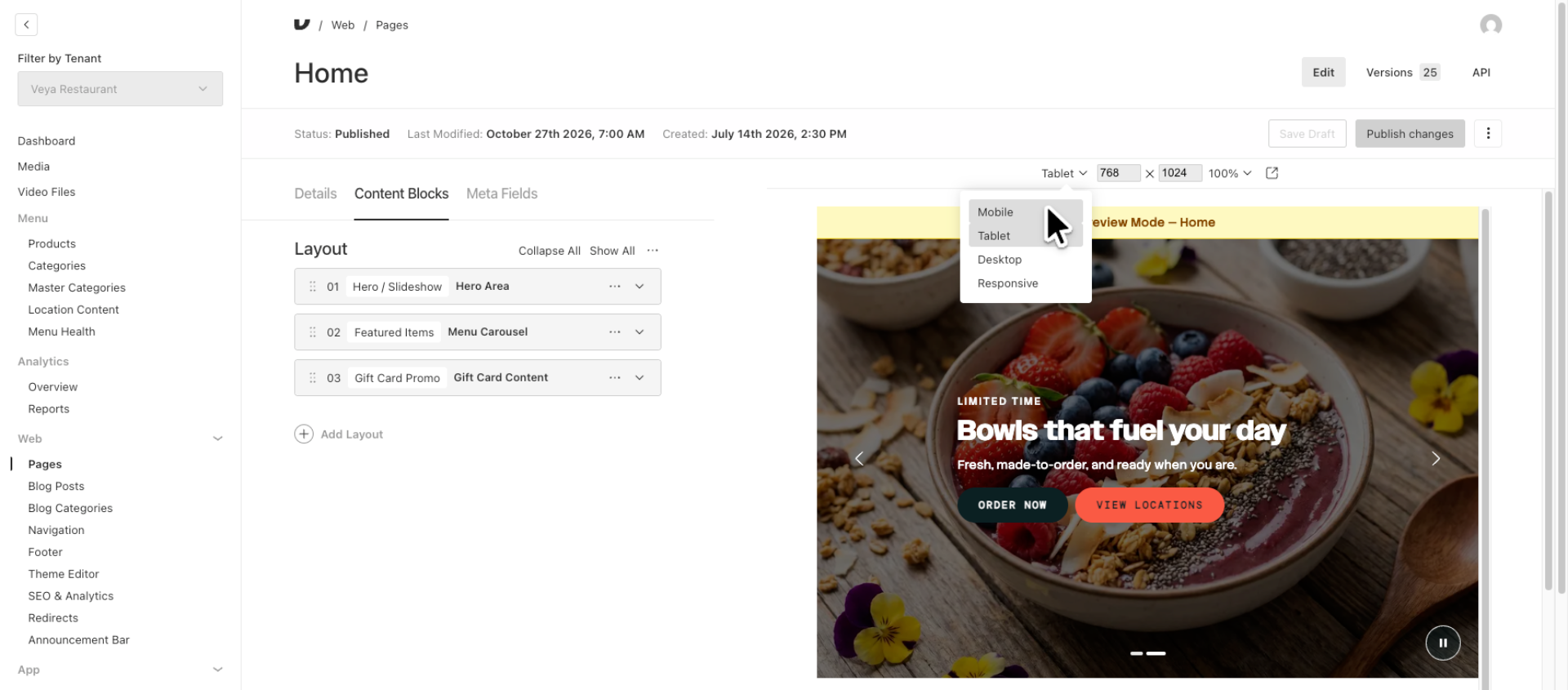
3. Switch to Mobile Preview Mode
Next, select the mobile view to examine the page layout on smaller screens. Since the majority of traffic for most brands comes from mobile devices, ensure that you consistently check how your page appears on smaller screens.
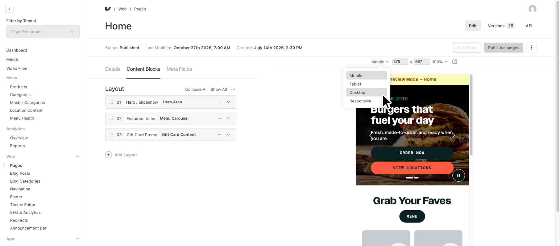
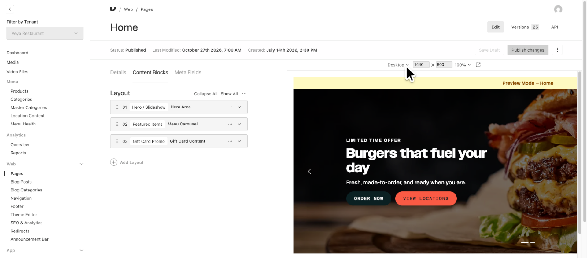
4. Return to Desktop Preview Mode
Return to the desktop view by selecting it from the dropdown menu.
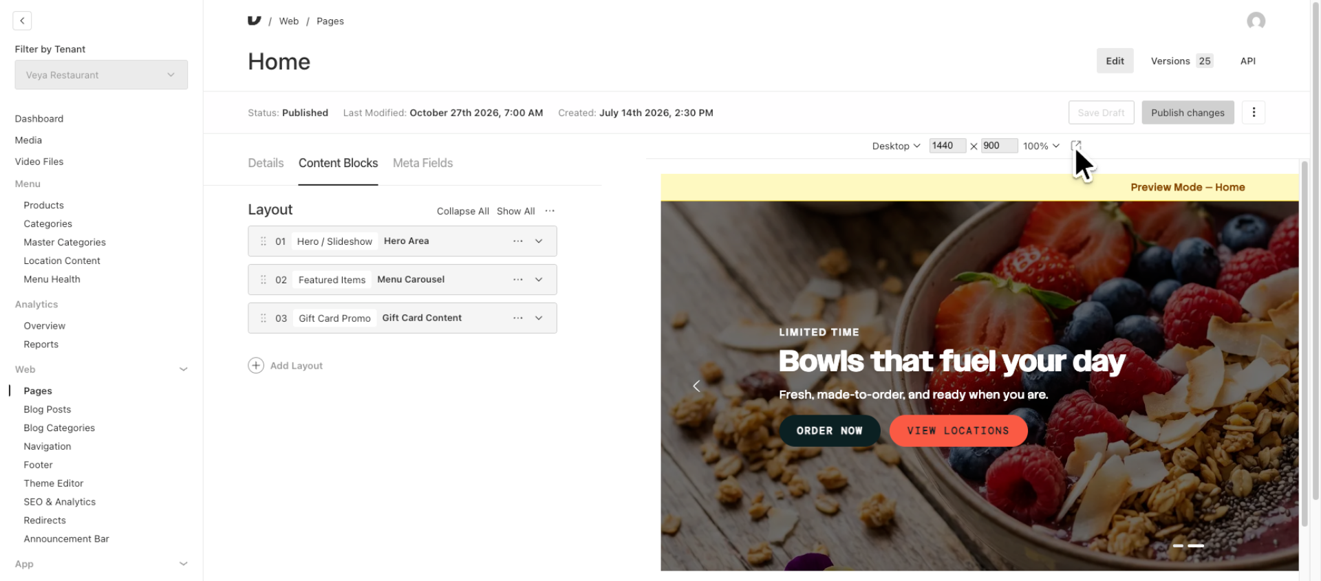
5. Open Preview in Separate Window
To see your preview in a full screen window, click the full screen icon.
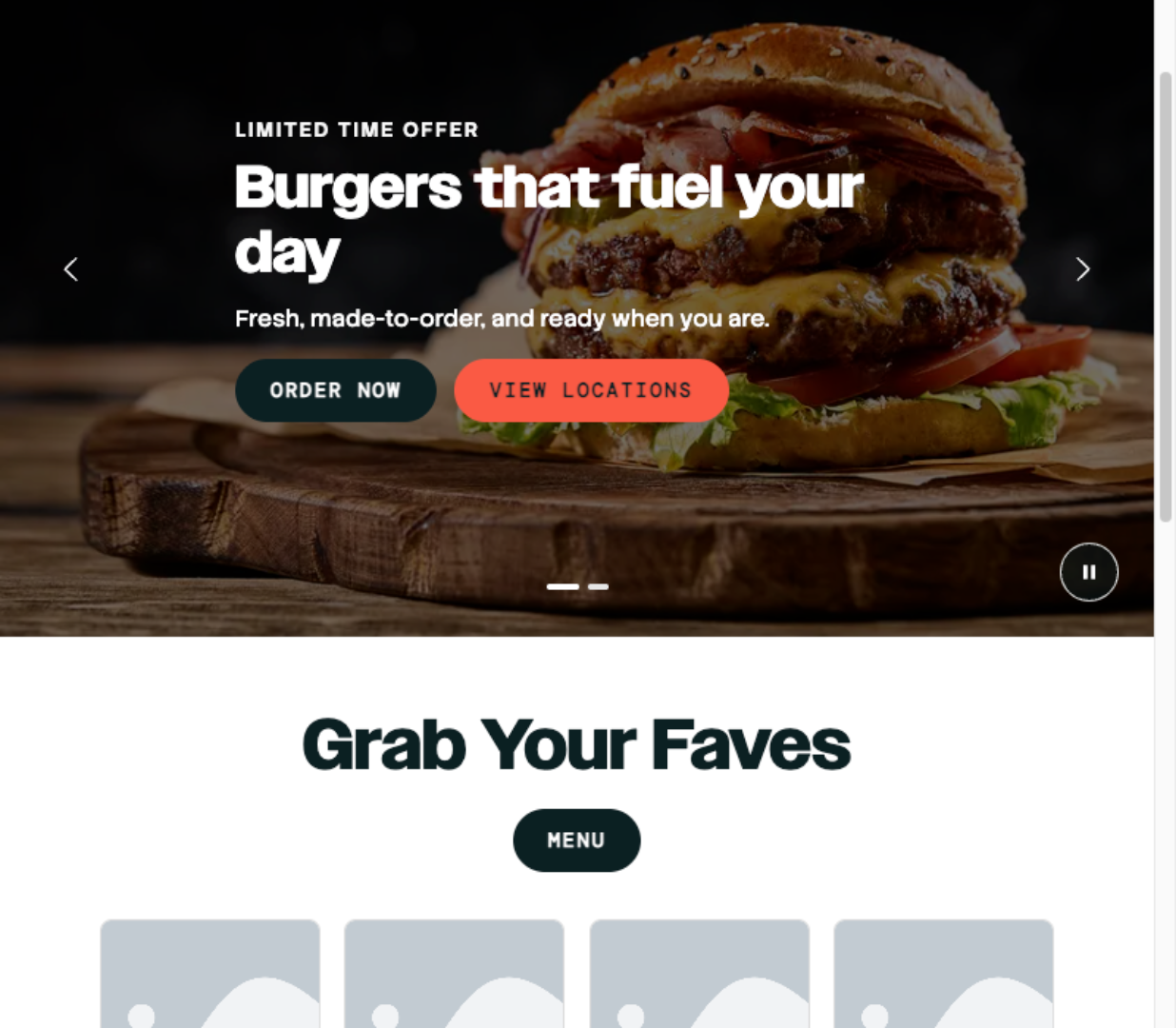
6. View Full Preview Window
Your preview will now display in its own window so you can see how the page will look in a fullscreen. Simply close the window to return to the CMS.
7. Check Device Sizes Before Publishing
As a best practice always check the various screen sizes before hitting Publish Changes.
This walkthrough illustrated how to preview page changes across desktop, tablet, and mobile views, open the preview in a separate window, and seamlessly navigate between the preview and editing interfaces to ensure your layout displays correctly before publishing.